DISCLAIMER: Some of the links below are affiliate links. If you buy something from a link, we may earn a commission. This is used to help maintain the site and create more content for you!
ABOUT LUMBERJANES: TRUE COLORS
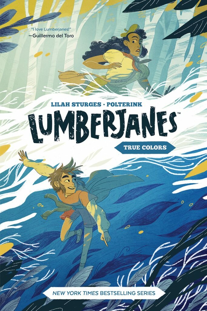
Lumberjanes: True Colors is a Graphic Novel written by Lilah Sturgess, illustrated by Polterink, and lettered by Jim Campbell. Alexa Sharpe does the cover while Marie Krupina designed the book.
Lumberjanes: True Colors follows Ripley, one of the campers featured as main protagonists on the regular Lumberjanes comics, as she, with the help of a magical creature called a Zebracorn, tries to “fit in” and blend in with everyone else after getting called weird. At the same time, there is grave danger looming on Miss Qiunzella Thiskwin Penniquiqual Thistle Crumpet’s Camp for Hardcore Lady-Types that may or may not feature fire-breathing creatures.
Lumberjanes: True Colors #1 is published by BOOM! Box
Lumberjanes: True Colors Review
Lumberjanes is a series that has lived in my periphery for years now. I have seen it mentioned here and there, including on this very website, enticing me to become part of its audience. The guerilla-style worth of mouth ad campaign is so viral it has infected many a website I frequent. I’ve even seen a handful of its covers and images appearing on other internet-based communities I’m a member of, but I just had never given myself the time to check it out.
I wish there were a real reason behind my apparent avoidance of this particular comic book series, but it was just a matter of “I was focused on other things” – which is as lame as an excuse as there can ever be. It just looked neat from afar, what with its Adventure Time-art style and joke structure. I simply failed to get closer.
I want to say I didn’t want to spoil its aura of niceness by reading it and potentially discovering it didn’t live to my own impossible expectations, but that would be both pretentious and self-libel. I was nothing but lazy. Whenever I saw it, I simply said “oh, yeah, I’ll check it out later”.
Now, as I find that the series is all but finished, that “later” has become a “now” – or a “before” if we acknowledge I had to write this after finally diving into the series. As of today, I have read through their latest graphic novel, Lumberjanes: True Colors just a few days ago. The moment things changed was when I found out one of the characters inside it story was a magical zebra unicorn riding a skate. One cannot simply say no to that amalgamation of concepts. I had to see where things were going from there.
Saying I was happily impressed by what is basically a spin-off title would be selling it short. If this were a teacher-like review, this would get the A grade as well as a happy face on the side.
To summarize my reaction: I regret not having jumped the bandwagon before it was about to leave for the sunset. True Colors was a lovely experience all in all: good art, good writing, great characters. A full-on “why are you not reading this right now instead of this review?” mark from me.
However, despite how intrinsically good this thing is, it managed to achieve something I never even though possible – be it a byproduct of Lumberjanes or anything else. Somehow, this book that was made in and for the year 2020 (maybe 2019) kind of made me want to live through the 90’s nostalgia wave that I have been dreading for so long. Apparently, Lumberjanes is my Spanish Inquisition in the sense that nobody was expecting that.
Ever since 2016 came around, when it felt like the cultural landscape’s craze with the 1980’s was peaking, I started to fear the nostalgia craze that would come next. If numerical logic was to be used, we were bound to apply a 1990’s filter to all our media coming forward. Current media empire CEOs were now preparing themselves for their one-way journey to the elephant graveyard of entrepreneurial usefulness. Now that trends were about to shift, they could feel they were on their way out. It was time to pass on the torch to someone with more gusto for a life without rest.
Whoever ended up becoming the new man or woman in the chair would, allegedly, be a human being that was objectively younger, someone who could reminisce fondly about a different decade encapsulating their childhood. According to predictions, they’d be people young enough to think the 90’s ruled, but not old enough to know they were wrong.
And, yet, here we are, about to get into 2021, eagerly waiting for yet another Ghostbusters movie to hit theaters, tweeting about our theories about the next season of Stranger Things, and listening to I Don’t Know How They Found Me’s 80’s inspired synthrock. All efforts to resurrect the 90’s during the last couple of years have failed miserably – just ask Johah Hill and Netflix’s 2018 entire output.
The Dreaded Next Wave Of Nostalgia
It’s been 40 years after the 80’s died and they simply refuse to leave us, haunting every move we make, every breath we take.
Full disclosure here, I am a 90’s kid, a description I have never carried with pride. Despite that stretch of time gifting the world with amazing ideas and franchises that we can still enjoy to this very day, the 90’s were a nightmare to live through. They were an all-out attack to every living thing’s eyes and ears. Proto-EDM beats, exaggerated facial features selling Fruit Gushers on TV, shoulder pads, guitar-shaped rubber bands that you could use as bracelets. Those ten years looked and sounded garish; phosphorescent sounds accompanying even brighter images that, even then, made no actual sense.

We’re talking about an entire decade where dumb, unbelievable, and cheap stuff ruled our minds. Where being good was pushed down our throats but also reminding us to be as far-out and tubular as legally possible. A decade where grown men in arguably unrealistic mascot suits became icons, where puns where the most valuable currency among writers, and music sounded like an ADHD bipolar kid that had no idea how exactly it felt to be happy or sad.
One could argue, and many have, that the premise of the entire decade was, if not original per se, pretty darn memorable. What with the constant posture of being “against the man” and the reinforcement of DIY projects that had tried to permeate the 70’s without a budget, now with extra radness. It wasn’t the worst of times, but it was very far from being the best of times.
I, unfortunately, was a key-demographic for most of what became popular way back when. Even though I did help create those empires through my interactions and consumption, when the year 2000 arrived I felt a relief I had never felt. This was over. The formulaic TV shows and comic books I was accustomed to were over. The lame cartoon episodes trying to get a moral across through boring and overdone tropes had finished. The color-grading was about to change into something that didn’t force our eyes to squint in order to not burn our retinas.
I was ready to see what was on the other side of the century, ready to see what the new wave of creatives had to say now that the decade that decided something like Sonic The Hedgehog was cool had died.

Joke was on me when the brooding 2000’s came and went with all their depressive glory, but I digress.
Jump cut 20 years and I am reading Lumberjanes: True Colors. Not gonna lie, as the premise and main theme of this piece was being revealed along its panels, I found myself huffing and puffing with a “not this again” force. Slap your friend’s hand if you’ve heard this one before: “this is a story where the main characters learn that BEING YOURSELF is the best thing you can be!”. Interestingly enough, just as you did, I also groaned the same way the children of the Magic School Bus did whenever Carlos uttered a joke mid-episode.
But this was supposed to be an award-winning series, so I soldiered on. You don’t get to win an award by being heavy-handed. And, as the story progressed, as the dialogues kept coming, as the action moved forward, I found myself feeling all tingly on the inside. The people behind it had done it. They were so good at doing this tried-and-true-Disney-Afternoon-lesson I was suddenly yearning to watch an episode of Captain Planet or Doug while badly programmed eurobeats featuring a low-pitched man reciting nonsense accompanied the sounds of a screaming woman. I wanted the 90’s to be real again. And it didn’t make me retch.
Once the book came to an end, I suddenly felt the urge of dusting off my PlayStation and sticking Tony Hawk’s Pro Skater on it to spend my entire afternoon pretending I was as cool as those polygons on screen. I felt home despite never feeling like the 90’s provided a home for my soul. It was a weird feeling, but it was not an unwanted one.
Now, I don’t think this was Lilah Sturges’ objective when penning this particular graphic novel, nor do I believe that BOOM! Studios is somehow invested in riding the 90’s wave as of today, but they do have demonstrated a knack of understanding modern trends in order to sell more comics. The fact that they publish such an unimaginable amount of franchise-based series every two weeks is nothing compared to the care they pour onto each and every issue. They’re good, is what I’m saying. A BOOM! Studios seal on a comic book cover is akin to a seal of approval… most of the time (although this is neither the time or text to digress into the meaning of those four words).
So… How Is This Thing?
What we have here is something that we have, gratefully, been receiving a lot of as an audience: a story about strong women written by strong women. It’s just pure talent on display. Even Twitter, with all of the supposed forced “strong women”ism they like to tout is drowning contemporary media whenever a main character lacks a natural-born penis couldn’t argue against this level of craft. The way every character is written is not only fun, but relatable and believable. Even if you’re not a tweenager inside a girl-scouts-like camp complex like our main characters, you can see a bit of your personality reflected back to you from the pages.
Honestly, the characters in this story are the best part of the whole package. They’re diverse, real and exciting. I loved every single one of them, flaws and all.
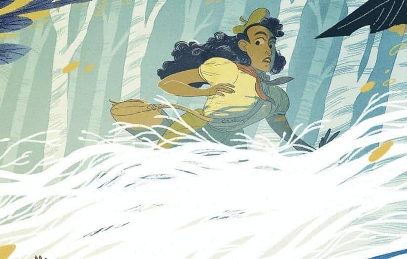
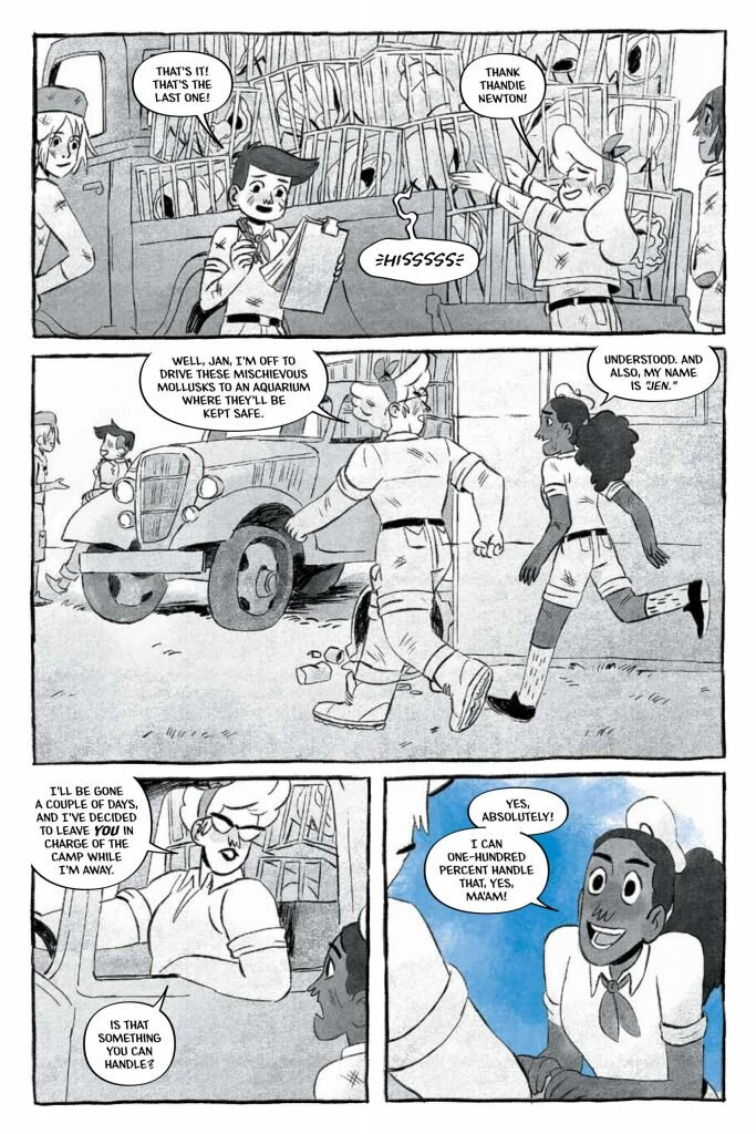
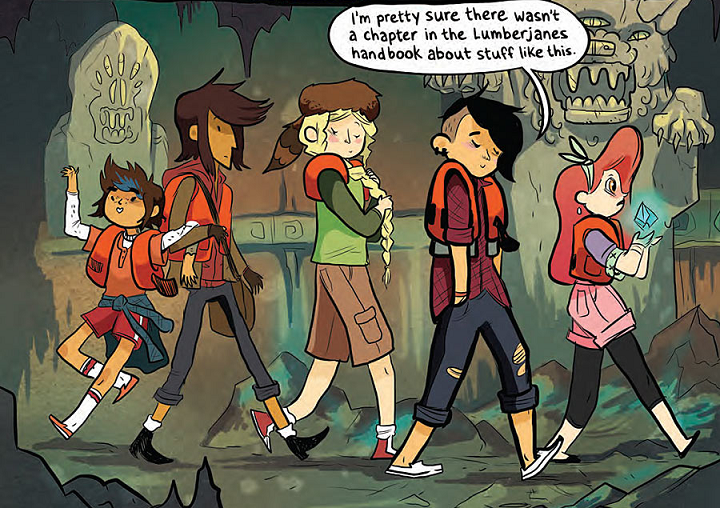
Not to be outdone by the written words that would usher us to use our own limited imaginations, artist Polterink decided to go all in with all the style and pizzaz she could muster. Everything on the pages is a gorgeous affair of sketch-like qualities. The emotions on show here look to be done as effortlessly as any child’s fingerpainted homework, emulating the carefree nature and kindness of every mood featured in the story. It’s so well constructed that nary a single element can be visually confused by anything else that what they are representing.
More so, this is one of those comic books where not a single line, be it a tree, be it a comic book panel or the walls of a cabin, is straight. Everything is squiggly, crooked, or bent. Everything is going for a natural feel, a “a real human made this with their hands” aesthetic. It’s a feast for the eyes of people that hate perfect emulations of reality inside their comics. A style that goes perfectly hand in hand with the dialogues referencing important female icons instead of any utterance to whatever deity you’d usually see in surprised expressions.
It’d be a perfect feast for the eyes if not for the presence of our old foe: computer-generated dialogue balloons. Their perfect roundness and perfect unified lie thickness do nothing but break any sort of visual unity every other aspect of the art was going for. It’s not like they ruin the art by all means, but they do hinder it quite a bit.

Do I hate that people use computers to help ease the burden of painstakingly drawing hundreds of panels in a month? No. The lazier an artist, the better – cutting corners in this business is a necessity I encourage. Nothing begets creativity more than the thought of doing less work to achieve a result. The thing is we need to use computer art correctly. Why on Earth, on a comic book were the only straight line is the paper the thing’s printed on, would you dare to put perfectly round balloons on top of it? It’s like trying to use a Papyrus for every instance of written text on a Pixar film because it’s your favorite font. It’s technically not wrong, but, like, it’s not enhancing anything.
I mean, I can’t even pretend to know how complicated or busy the life of this lettering artist is but… I can’t describe this as a good work. Not by a long shot. I concede that maybe, just maybe, the higher ups demanded this style to be used because reasons. But that’d be as lame an excuse as “I didn’t read a comic book series because I didn’t make time for it”, you know what I’m saying? It breaks the immersion.
There’s also computer-generated text for onomatopoeias. Not a fan. You get an almost watercolor vibe for even the black inks and you go and paste a regular font over it? Do we not like experimenting or is it a mandate to be boring? I really hope it’s the latter.
Conclusion
Circling back to my original point, what does a story about a group of girl campers defeating giant clams with feet and other magical creatures has to do with the 90’s? Well, as is the case for most things good in this world, it’s not the story, per se, but how it’s told. Granted, it does feel like the staff behind it looked at the TVtropes page of every “a very special episode of” any TV show of the 90’s. However, it’s also obvious they followed that thought with a “it’s like that, but if we actually believed our audience was smart” in order to conclude their pitch. I’d also approve it as a producer.
The “BE YOURSELF!” lesson is one we’ve been learning since, at least, the day Disney’s Aladdin was released on theatres. It’s a lesson every single media for kids has been distributing our way since time immemorial. No main theme has been more re-hashed to death, except, perhaps, Pulp Fiction’s Misirlou. We not only know the importance of being ourselves – whether we practice it in real life or not is a completely different matter – but we expect it to be the de facto theme of children’s media. We are expecting more by this point in time, a second lesson to accompany the basic gravy of Disney themes.
And, still, Lumberjane: True Colors rolls with it. It sticks to its guns, focusing entirely on the idea that people pretending to be something they’re not will ultimately lead them to their doom. Best thing is, they do it in such a way you forget every preset installed in the hard drives of your mind to accept it with open neurons. And the secret is the same one that Ryan Reynolds has used to become a massive cultural icon as of late: being self-aware.
Lumberjane: True Colors knows you’ve been exposed to this idea a million times, it knows you’ve heard it so much that even people in the real one repeat the saying on a loop. There are even ready-made posters for any school to buy and paste them all over their halls in an effort to create the perfect sense of irony. The characters contained in this story are also aware of it, aware of how obnoxious it is to hear that moral once again. But everyone, be it the fictional people we follow here or the real creators behind them, also know how important it is to reiterate this message, to reiterate how important it is to not conform to the norms. That’s why they play with it, that’s why, instead of beating you over the head with this dead horse, they invite you to consider how a normal person would react with what’s happening on the comic book.
And they do all this without breaking the fourth wall, not even once. That’s what I call restrain.
They create a story that, on the surface, seems so basic and superficial as ant, but once you read it you start seeing the layers of both care and talent imbued into it. And, by doing so at the same time they stick to the basic structure of the tropes they chose, it made me misremember every “a very special episode of” cartoon I saw on the 90’s. It made me remember how I enjoyed these things without even considering how formulaic they were. It made me nostalgic for a time that, in my memory, is way more interesting than the hard facts I know are true. It made me think the 90’s were actually cool.
But, especially, it made me want to keep on reading the adventures of these characters. That is the highest grade I could ever bestow upon a spin-off.
In other words, go and read this. You will not regret it. Reading is rad, yo!
Engage with the Creators
Lilah Sturgess – Twitter
Polterink – Twitter
Jim Campbell – Twitter

