Dryad Volume 2 Review
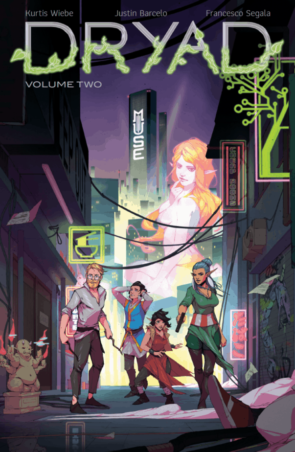
Dryad Volume 2 is a fantasy comic book from Oni Press with a compelling and vibrant art style. It is written by Kurtis Wiebe, illustrated by Justin Barcelo with letters by Jim Campbell and colors by Francesco Segala. Readers who enjoyed comics like Rat Queens will likely love this title as well.

Dryad Volume 2 Synopsis
In the first volume, Dryad explored a more familiar fantasy setting, but by Volume 2 we have fully transitioned into a futuristic and foreign world.
In Dryad Volume 2, the Glass family finds themselves divided in the glittering neon setting of Silver Bay City. Yale and Morgan want to protect their children and learn more about the origins of their children’s magic. The twins have lived a quiet life up to this point, and now they have a vast and different city laid out before them. With new opportunities come new dangers.
Llewellyn, Yale’s brother, is put on the case to find Yale and deliver a message from his father. We don’t know about the relationship between the two, but it definitely seems tense. Llewelyn seems a bit bitter over the assignment, both because his father asked him to investigate his brother’s “Death” years ago and now he seems to be back on that same trail.
Weibe is best known for his past work on Rat Queens. Dryad has much of the same vibe as his previous work, but a wildly different dynamic between the core characters. Where much of Rat Queens is about found family and those you choose to have at your side, Dryad centers on an actual family and much younger characters.
Barcelo’s skills and strengths lend themselves perfectly to Weibe’s irreverent storytelling style. Dryad Volume 2 has imagery that calls to mind Bladerunner, but some of the images are more salacious and alluring. Silver Bay wants to draw you in, and Barcelo’s art helps establish how the city will seduce you. The creative team works seamlessly. You can tell their influences all flow together to create the vision for this story.
The Mother of All Badasses
One of the hallmarks of Weibe’s work is that women are allowed to be irreverent, but they are not regarded as being unfeminine for doing so. This trend continues in Dryad with the character of Morgan. Morgan is the mother of the twins, she’s beautiful and intense at times, but by her own admission, parenting her children did not come easy to her.
In comics, we often see the trope of the dutiful mother. Spider-Man has Aunt May, Superman has Martha Kent. In these stories, women usually only fit into one category. They are there to be the emotional core for their child, a soft place to land when the world gets dark (and a vulnerability to be exploited once they are discovered). In most pop culture, it’s a lot less common to see a mother portrayed as both dedicated and badass. Dryad does an excellent job of making Morgan feel dynamic but still feminine and loyal to the role she had chosen to take on for her children.
Even though Morgan feels insecure about her parenting because she does not fit that archetype, we don’t think she’s a so-called “bad” mother. She abandoned everything she knew to keep her children safe and sacrificed for them while remaining true to herself. She is attractive and powerful throughout both volumes. This depiction of dynamic womanhood and motherhood is intriguing and seamless.
It also works well with the continued theme of the story, which is all about families and often about parent/child relationships – Morgan and Yale’s connection to the twins, Yale’s relationship to his father.

The Dryad Artwork nails the Sci-Fi/Fantasy Aesthetic
Once again, Barcelo, Campbell, and Segala nail the fantasy sci-fi aesthetic, often through ways that feel subtle. Sometimes when teams fuse sci-fi and fantasy, you get very cyborg-looking elves and Orcs with overwhelming technology. In Dryad, the character designs are often much easier on the eye, and the enhancements they carry seem to blend in with their style easily.
I also love that the art team takes an inclusive approach to character design. In this story, we see people (and elves/orcs) of all different sizes, shapes, and colors. The diversity of Dryad feels accurate and strengthens the world of the story. Silver Bay is a city where people of different races, cultures, and lifestyles find themselves caught up in the same somewhat broken space.
The world still felt futuristic, but the characters felt clean and sleek compared to some sci-fi depictions of the future. Silver Bay is a world where those with cybernetic enhancements still look relatively human, even if parts of their human body are long gone. We see this especially with members of the Glass family like Lou and Estelle. Both mother and son have lines on their face that show something has been changed.
From the story, we get the impression that his father altered a lot of his physique to save Lou after he attempted to take his own life. There are understated lines and bolts on his hand, but it still holds the curvature of a normal human hand. For Lou, the most distinct part of his technological upgrades is a very obvious plate on the back of his neck that covers his spine.
One of my favorite panels was one where two characters discussed some of their commonalities. I typically don’t look closely at panel design until my second read-through of a comic, but this one stuck out to me. The first character, Estelle Glass, is looking forward, and the other one, Morgan, is looking at Estrelle with a scrutinizing expression. Even though the art is drawn as one panel, the conversation us cut into two panels. The panel break puts a little bit of distance between the two characters while highlighting their reactions.
Color accents different parts of the story, and the palette frequently shifts between scenes. When the family is with the Sower, they are mostly enveloped in neutral tones. As they move into flashbacks or magical sequences, the palette changes to show us that the setting has changed completely.
Different color palettes are also used to make parts of the world harmonious but visually distinct. Silver Bay has large, alluring projections of both female and male bodies that hover over the skyline. The lighter colors used on them give off an almost neon-like effect. I noticed a similar color choice was used with some of the story’s magical elements, giving them a surreal glow. This approach to color seems to highlight both the fantasies that people conjure in their minds and the fantastical elements of magic within the world of Dryad.
The lettering is seamless. It is used in very subtle ways to accent both action-packed scenes and quieter moments. There is never a moment where it feels off or overdone.
Dryad Volume 2 Conclusion & Overall Review
Once again, the team on this book knocked it out of the park. I thoroughly enjoyed the first volume, and I was just as compelled to make my way through this volume. This title has easily been one of my favorite stories so far this year.
Families are the core of this story, both found and biological. There are also several unexpected twists and turns in the story that I would not want to spoil for you, but the payoff is impressive. It also triggers some of the characters to take journeys of their own.
If you enjoy sci-fi and fantasy comic stories with a bit of intrigue, it is worth picking up this volume. You will enjoy the ride!

Want more Graphic Novel reviews?
RELATED ARTICLES:
1. Canopus Volume 1 Superbly Balances Sci-Fi and Self-Healing
2. Scout’s Honor Volume 1 Stands on Incredible Merit
3. The Old Guard Volume 1 Blends Chaos with Soul Searching
4. Hellboy and the B.P.R.D. – Family Ties stands on its own!


